LuxSmart Case Study

One homeowner, many devices, little time to learn
This app is designed for a homeowner using an already connected ecosystem across multiple rooms. They don't want to spend time learning how to set things up and want quick access to commonly used actions.
Existing apps offered useful patterns for managing complexity
Apple Home combines favourites with room browsing, Google Home separates automation starters from actions, and Savant can capture existing settings as a scene. These patterns helped me separate quick control, complete browsing and routine management.


Exploring visual layouts and trade-offs
I compared layouts by what stayed visible and what required another step. I prioritized everyday controls on Home, routine context in Scenes, and a combined security overview.


Home: Room, dashboard and system-led layouts gave way to frequent actions first.
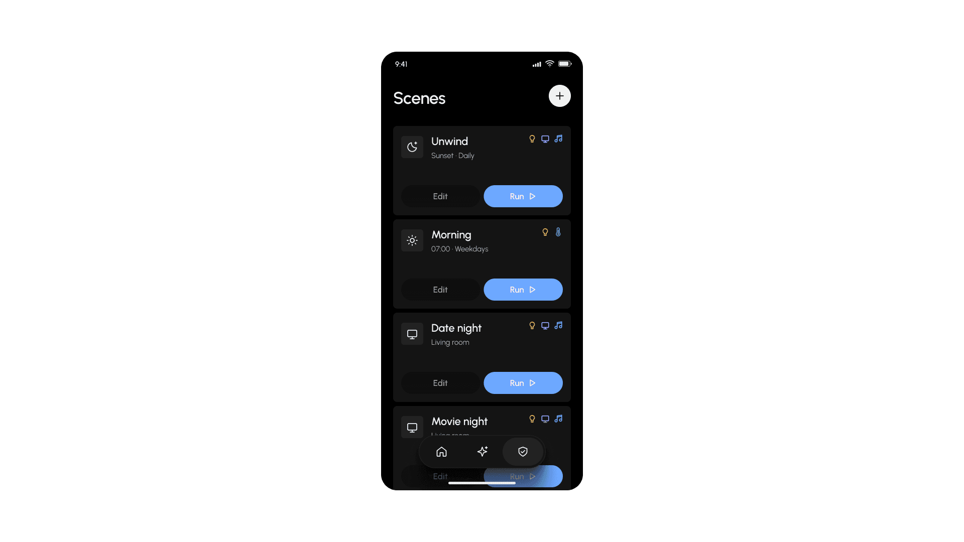
Scenes: Full-width cards preserved context, accepting more scrolling.
Security: Four smaller previews with lock status and recent activity.
Quiet selective colour is closest to luxury
Monochrome offered fewer functional cues, large imagery pushed controls down, and broad accent surfaces competed for attention. I kept the quiet foundation and used smaller colour cues to distinguish actions and systems.

Typography and colour
Urbanist separates prominent device values from names and supporting context. A neutral ramp anchors the dark interface, while blue, violet, amber and mint provide selective emphasis.


Home brings familiar actions into view
I grouped lighting and climate into distinct cards with direct controls and prominent values, keeping scene shortcuts above complete room browsing.

Scenes make Run and Edit explicit
I replaced the visible scheduling controls with Edit and Run, keeping names, timing and included systems available for context.

Security shows status, cameras and recent activity
I retained the status → cameras → activity hierarchy, reduced coloured surfaces and added “Last checked” context to the door summary.

All screens share one visual language
Consistent typography, Lucide icons, spacing and surface treatments connect the screens, while floating navigation provides a shared route between them.

Simplicity came from deciding what to cut off
The explorations showed me how imagery, density and colour could compete with useful controls. Choosing what to emphasise mattered as much as choosing what to include.

With more time, I would test all flows with users to find moments where it fails
With limited time, I focused on the main screens rather than complete flows or usability testing. Next I would build a full prototype with all core flows and test with real users.